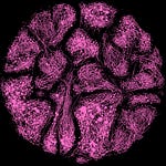
As the definition has it, a choropleth map is a type of thematic map where areas are shaded or patterned in proportion to a statistical variable being displayed.
In this example, first I collected the neighborhoods of Budapest, then used mapclassifier to group them into quartiles based on their area (meausred in sqm), and then colored them accordingly - from the smallest to the largest, from blue to pink.
Imports, data
import osmnx as ox
import geopandas as gpd
import matplotlib.pyplot as plt
import numpy as np
import sys
import mapclassify
import matplotlib.colors as mcolors

cmap = mcolors.LinearSegmentedColormap.from_list("blue_pink", ["#4DFFFD", "#ff6ec7"])

city = "Budapest, Hungary"
tags = {"boundary": "administrative", "admin_level": "10"}
gdf = ox.geometries_from_place(city, tags)
gdf = gdf[gdf.geometry.type.isin(['Polygon', 'MultiPolygon'])]


bp = ox.geocode_to_gdf(city)
gdf = gpd.overlay(gdf, bp)
gdf = gdf.to_crs(23700)
gdf['area'] = gdf.geometry.area

gdf.plot(edgecolor = 'w')
Creating the Map
column_to_classify = 'area'

# Classify data
classifier = mapclassify.NaturalBreaks(gdf[column_to_classify], k=50)
gdf['class'] = classifier.yb.astype(int)

# Create the figure with a black background
fig, ax = plt.subplots(1, 1, figsize=(10, 7), facecolor='black')

# Plot the geodataframe
plot = gdf.plot(column='class', cmap=cmap, linewidth=2, edgecolor='k', ax=ax)

# Customize the title and axis
ax.set_title("Choropleth Map of Neighborhood Clusters", color='white')
ax.set_facecolor('k')  # Set the axis background to black
plt.savefig('DAY16.png', dpi = 150, bbox_inches='tight', facecolor = 'k')


